As we move into 2026, interior design is shifting away from fleeting trends and loud statements toward palettes that feel timeless, grounded, and deeply personal. According to multiple paint-brands’ “Colour of the Year” announcements, we’re seeing the rise of rich neutrals, earthy tones and nature-inspired shades that give homes a sense of authenticity and ease.
Here are the key colour stories for 2026 — and how you can bring them to life in your home design choices.
1. The “New Neutrals”: Brown, Charcoal, Khaki


One of the strongest signals for 2026: neutrals are not going pale and washed-out — they’re deeper, warmer and more textured. For example:
Benjamin Moore’s pick “Silhouette” is described as a rich espresso-with-charcoal undertones. Southern Living+1
Sherwin‑Williams (with HGTV Home) named “Universal Khaki” as their 2026 colour: an adaptable beige-khaki that plays across styles. The Spruce+1
Designers point out that we’re trading the high-contrast black/white palettes of the last decade for grounded tonal shifts. ELLE Decor
Why it works for homewares: These neutrals provide a stable base — they let your accent pieces pop, textures shine, and seasonal shifts happen without repainting. Whether it’s cushions, throws, ceramic vases or lamps, pairing with a deep charcoal, khaki or warm brown base makes for a versatile backdrop.
How to use it:
Select a handful of signature items in rich neutral finishes (e.g., matte charcoal ceramic, khaki-toned linen cushions).
Complement with materials: warm woods, aged metals, stone.
Layer accessories in richer accent colours (see below) while keeping the base neutral.
2. Nature & Jewel Tones: Greens, Ochres, Deep Reds
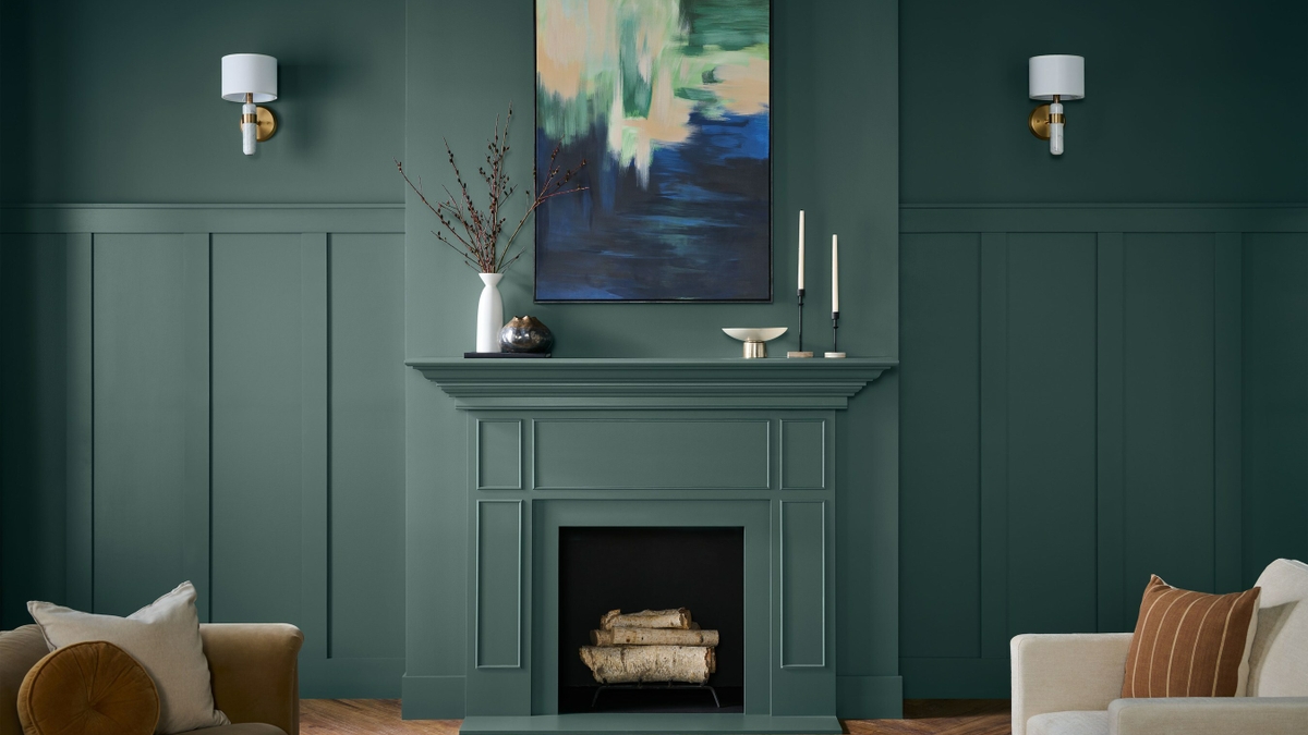


Alongside the new neutral base, bolder hues are emerging — but in more thoughtful, grounded versions:
Deep jade/green (for example: Behr’s “Hidden Gem”) is gaining ground as a way to bring nature-inspired calm indoors. The Spruce+1
Ochre and muted yellow tones (for example: C2 Paint’s “Epernay”) show up as historic-charm neutrals with warmth. The Spruce
Rich berry or mulberry reds (e.g., Graham & Brown’s “Divine Damson”) signaling a turn toward expressive yet refined colour. Ideal Home
Why it works for homewares: These hues are aspirational but wearable — they give “personality” to a space without feeling gimmicky. In products: a jade-green ceramic planter, an ochre linen table runner, a mulberry throw can all feel current and sophisticated.
How to use it:
Use deeper greens or jewel tones as accent colours: one or two items in the palette can transform a shelf, side table or vignette.
For ochre or muted yellow, consider soft furnishings (cushions, rugs) rather than full walls, unless you’re bold.
Berry/mulberry tones work beautifully as statement items — e.g., an armchair, wall art or a collection of smaller accessories grouped together.
3. Earthy Textures & Authentic Materials
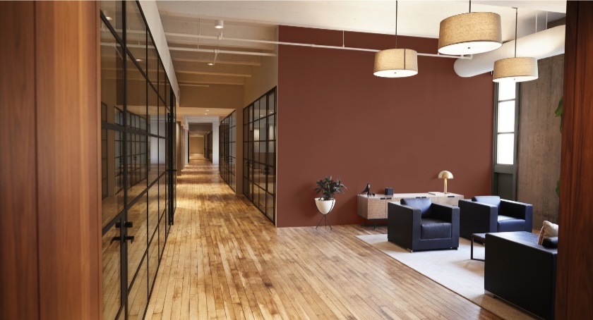

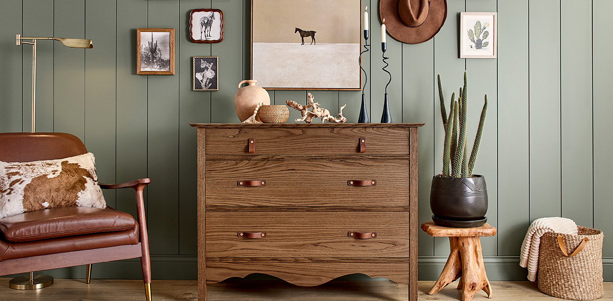
Colour trends for 2026 are also deeply tied to materials and texture. Warm woods, stained finishes and tactile surfaces are very much part of the story. As one forecast from PPG Paints notes: design is built for “play, imagination and togetherness” and grounded through natural materials. PPG Paints
For instance:
Wood-stain brand Minwax picked “Special Walnut” as its colour for 2026 — reinforcing the role of wood and finish in the palette. The Spruce
The rich red-brown “Warm Mahogany” has been adopted as a major directional shade for 2026. PPG Paints
Why it matters: Homewares are more than colour – they’re about touch, feel and story. When colour is tied to material (wood stain, boucle fabric, heavy linen), the interior feels layered and meaningful.
Product ideas:
Wooden objects (bowls, trays) in walnut or mahogany tones.
Textiles in boucle or textured linen in these rich neutrals or accent colours.
Metal finishes with depth (aged brass, burnished copper) to frame and complement the colour palette.
4. Mood & Mindfulness: Spaces That Feel Grounded

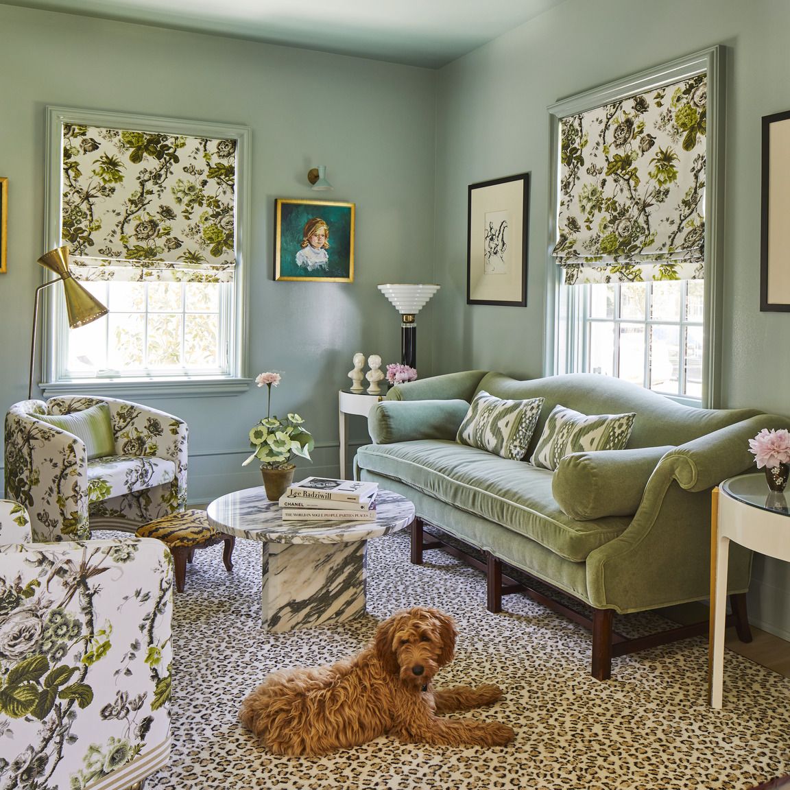
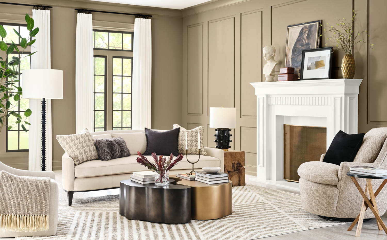
What ties these colour stories together is a subconscious desire for environments that feel restorative — not overstimulating. Multiple sources highlight that 2026’s palette is mellow, intentional, and less about fleeting novelty. ELLE Decor+1
Final Thoughts
2026’s decorating colour story isn’t about loud, fleeting looks. It’s about depth, return to nature, material richness and personal meaning. By choosing designs rich in colour, texture and storytelling — you’re giving your home a spave that will feel right now, and last.
